
NYC Health and Demographics
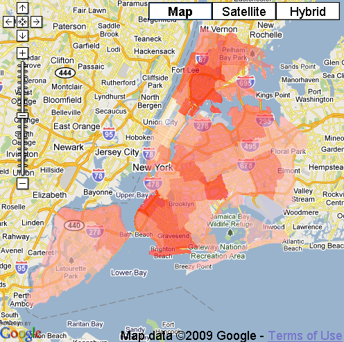
Users can compare results from the Community Health Survey with demographic information from the 2000 US Census on a map. Data is shown as a thematic map (coloured polygons), using Google Maps as a base.
Users can switch very quickly between different health layers (like "percent of the population who currently smokes") and demographic information (like "median income").
0 comments